 About Me
Bootstrap 3, Review and Demo (Quick Web Apps Part Four)
Twitter Bootstrap 3 came out this week, so naturally I decided to kick the tires and share my thoughts on it. I've worked with other CSS frameworks (Skeleton, Bootstrap 2 and Zurb Foundation 3 & 4), so I had an idea of what to expect. I wouldn't say I was blown away by the difference between Bootstrap 2 and this third generation, but it did have some interesting new features that will make things easier for developers and designers.
Mobile First and Flat Design
One of the primary changes in Bootstrap 3 (and seen previously in Foundation 4, which is used by whateverthing.com) is an emphasis on Mobile-First responsive design. The goal is to elevate the mobile experience to a first-class citizen of the design process, because several billion mobile users is quite a large market to tap into. Bootstrap 3's new column naming scheme is designed to make it easy to target Mobile, Tablet, and Laptop/Desktop experiences.
The 12-column grid system now allows you to specify unique proportions for "xs" (extra small), "sm" (small), "md" (medium), and "lg" (large) screen widths. If you want your site to be a 3-column experience on a desktop, but only two columns on a tablet, you can achieve that by using a combination of the column widths - and that third column could then wrap above or below the rest of the site, or even be invisible, depending on your preference. (Visibility classes allow you to make content visible or invisible on various display sizes.)
Bootstrap 3 also features column "push" and column "pull" classes. This allows you to do some fancy tricks, like what I did for Whateverthing's sidebar: instead of being limited to defining column 1 (the body) and column 2 (the sidebar) in a particular order, you can use pushing and pulling to reorder them for certain display sizes.
Additionally, Bootstrap 3 does away with the bubbly decor of Bootstrap 2, in favour of a flat design. Flat design is a bit of a controversial topic, with many detractors, but it's also catching on in design circles. Along with Parallax effects ... but Bootstrap 3 doesn't have built-in support for that. At least not yet. :-)
The Demonstration
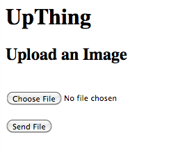
Well, as it turns out I have the perfect project to get a bit of TLC from Bootstrap 3. In my Quick Web Apps series of posts, I created a miniature monstrosity named "UpThing". One look at part 3's spartan upload form is enough to terrify small children.
Bootstrap to the rescue! After getting the source uploaded to github (and finding and fixing several bugs in my Part 3 post), I kicked the interface up a notch as an off-the-cuff "Quick Web Apps: Part Four".
Here's the before (taken from the 0.3 branch):

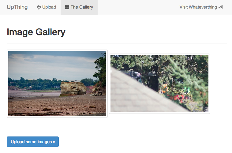
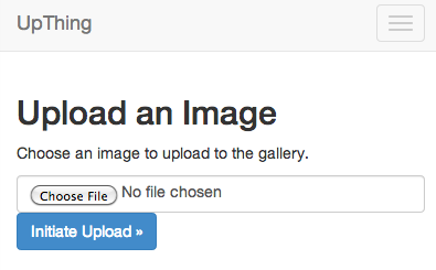
And here's the after, from branch 0.4, on a laptop screen:

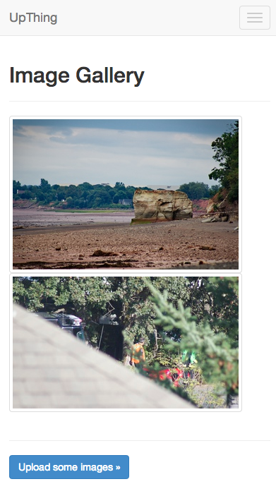
When the browser resizes down to iPhone width, here's what the result looks like:
The conversion wasn't without hurdles, though. I ended up not being pleased with how I used composer + symbolic links to get the Bootstrap CSS files into the project; I'll have to research Composer configuration a bit more to see if I can actually tell it to place packages in a custom location. (My interim solution was to use the commands "ln -s ../vendor/twbs/bootstrap" and "ln -s ../components" in the web/ folder)
In terms of Bootstrap-specific hurdles, mine are mostly minor and easily-solved. I'm not entirely happy with how the upload form looks on mobile (even though it would be an easy fix in my CSS, I guess I was just hoping for a bit more hand-holding). I was also disappointed with the lack of an easy Lightbox-type solution (similar to Foundation 4's "Clearing" add on), but maybe they plan to add that later - plus, it's not too hard to find a drop in solution anyway.
One confusing issue I encountered resulted from having defined my own "container" class (common in earlier Bootstrap/Foundation projects) - it broke many of the media queries that enable Bootstrap sites to be responsive. Once I got rid of my custom definition, things worked a lot better.
You're welcome to peruse the source on Github. It's not the prettiest project in the world, but it looks a whole lot better than it did before.
The Verdict
I wasn't blown away by Bootstrap 3's awesomeness, but perhaps that's because I've already been spoiled by the ease of use of Bootstrap 2 and Foundation 4. CSS frameworks are a great way to get simple projects up and running without being distracted by a huge amount of pixel pushing and finicky browser glitches. Skilled HTML5/CSS3 designers can do amazing things with CSS frameworks, as well, so keep that in mind when starting a new project from scratch.
One drawback to the proliferation of Bootstrap is that a lot of sites tend to have a "generic bootstrap" look; it's a very good idea to go through your site and customize/tweak a few things, to set yourself apart from other projects.
Perhaps the most important improvement of Bootstrap 3 is the switch to Mobile First. The flexibility it provides is going to do wonders to unlock the worldwide mobile audience.
That's all for now - thanks for checking in!
Continue to Part 5 (PHPUnit) »
« Back to Quick Web Apps: Part 3
View the Source on GitHub »
Published: August 21, 2013
Tags: coding, development, dev, howto, quick-web-apps, bootstrap, responsive